FLASH WARNING ; If you are sensitive to flashing images, there is minor usage of such in this piece. Please proceed with caution if you are sensitive to these elements.
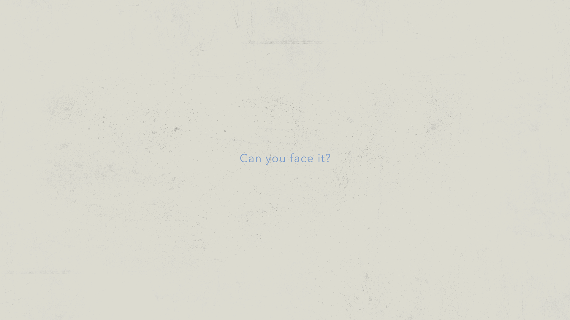
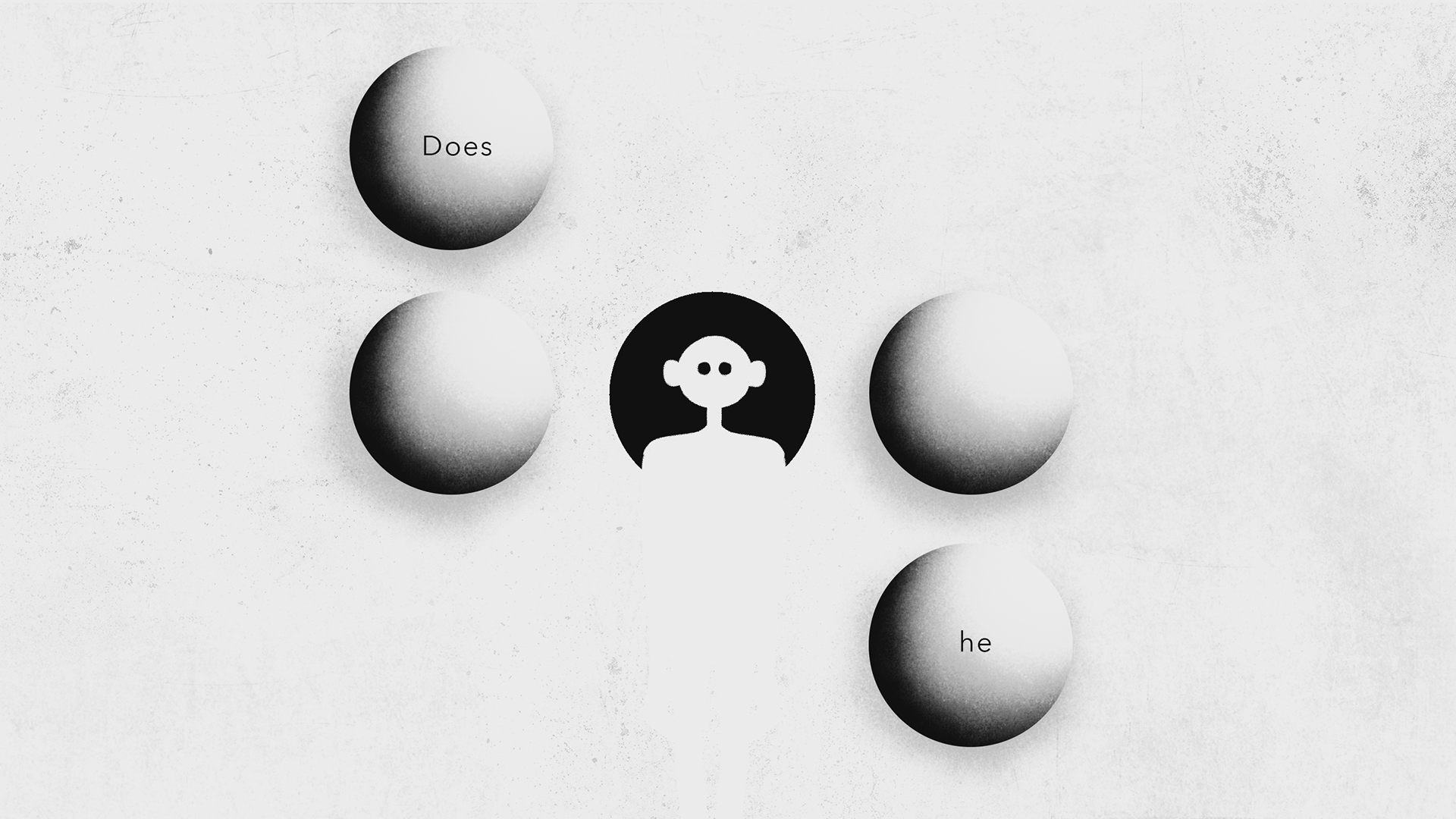
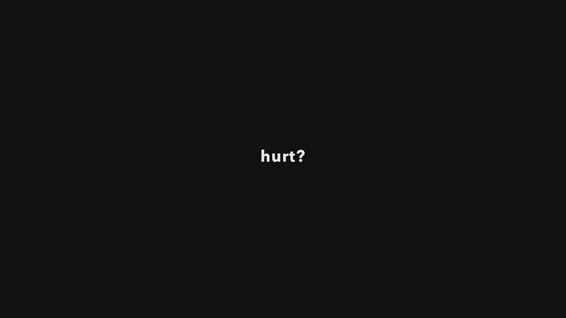
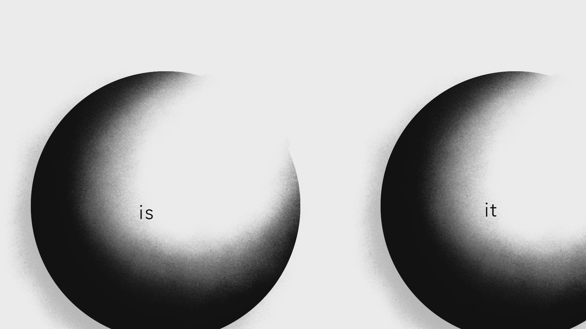
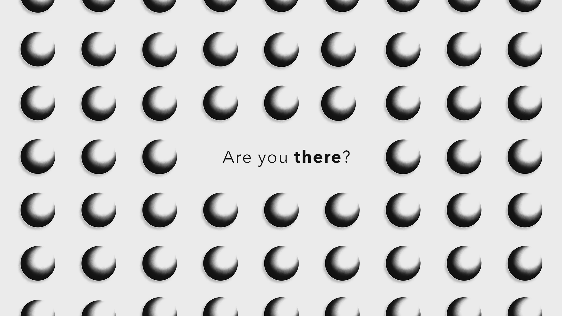
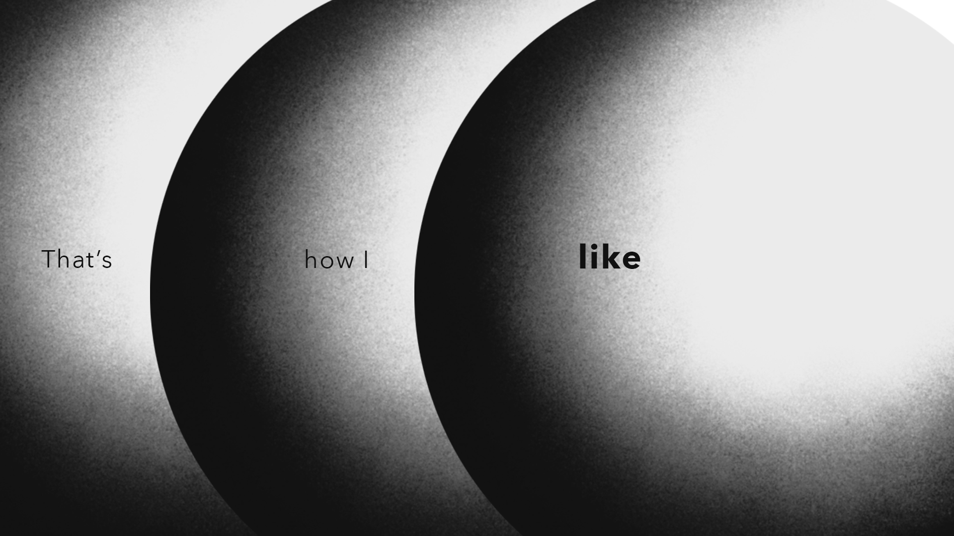
This piece is a type-based animation of Alissic's song "Like". In her words,"'Like' is about feeling your emotions. Sometimes, our brains play tricks on us. Not everything they tell us is true. We have to check in with ourselves and be sure of our emotions. You know, if we try to ignore them, they become very big".
SOFTWARES
Adobe Photoshop ; Used to design and build assets.
Adobe After Effects ; Used to keyframe animate and composite assets.
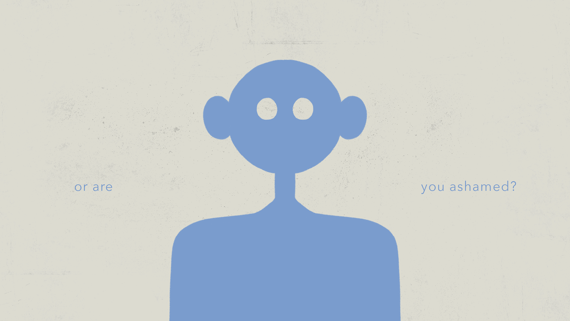
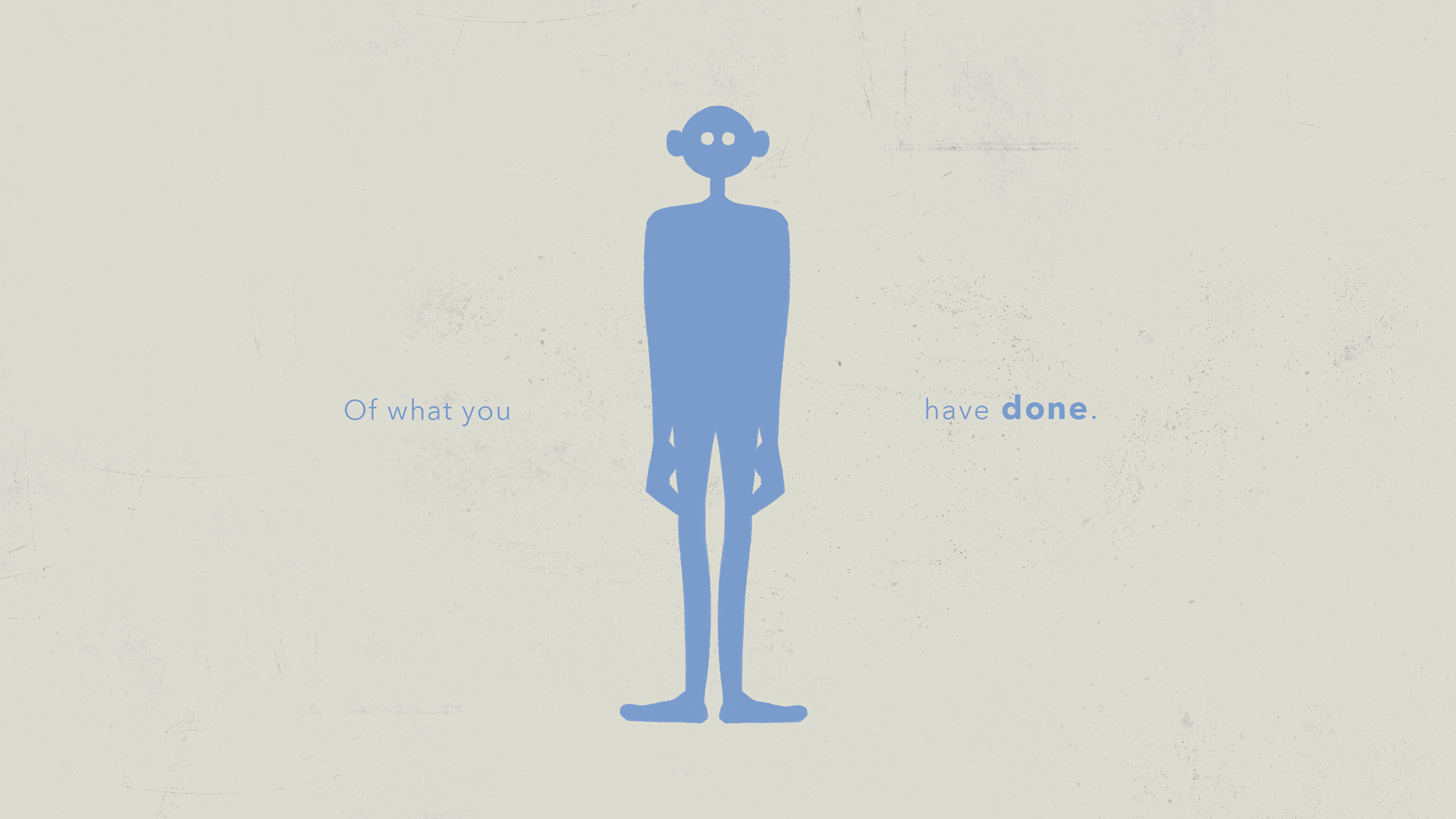
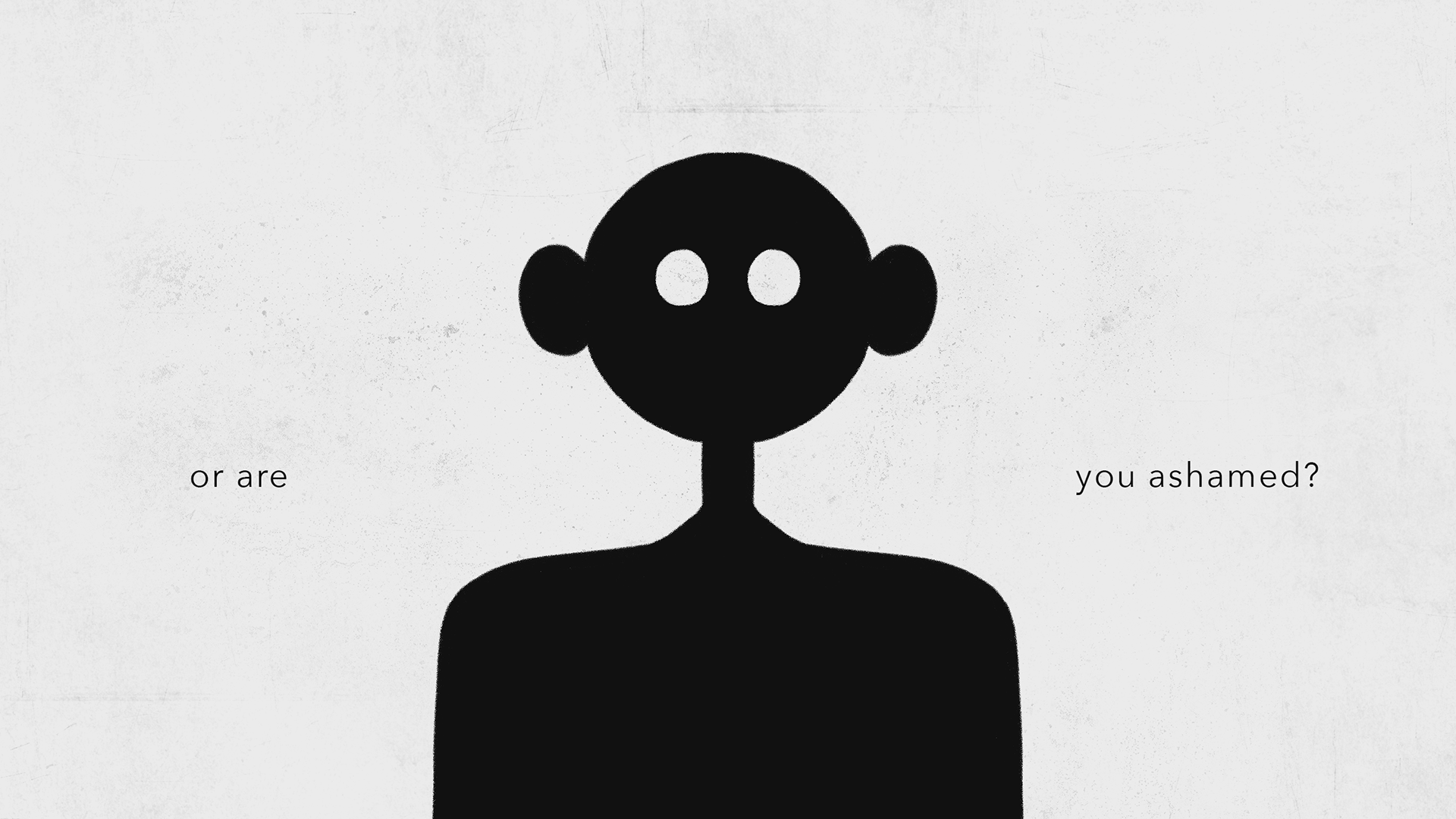
Alissic has a soft, soothing, singing voice, but the lyrics she sings create an uneasy feeling as she asks the audience personal questions, then proceeds to unpack her own emotions. The lyrics are confrontational and create an interesting contrast with her soft voice and calming music. This clash reminds me of the Japanese concept of “yami-kawaii”, which means “creepy cute” or “unsettlingly cute”.
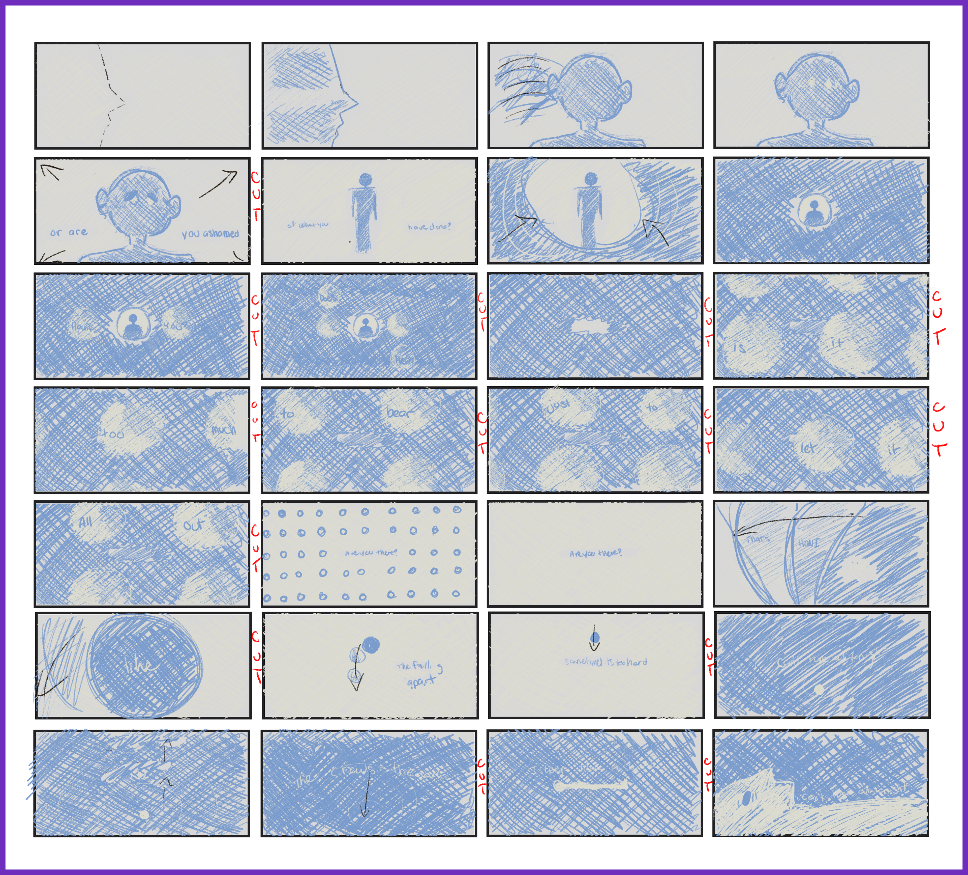
Storyboard
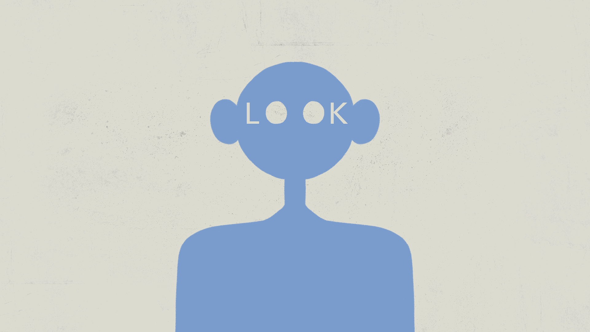
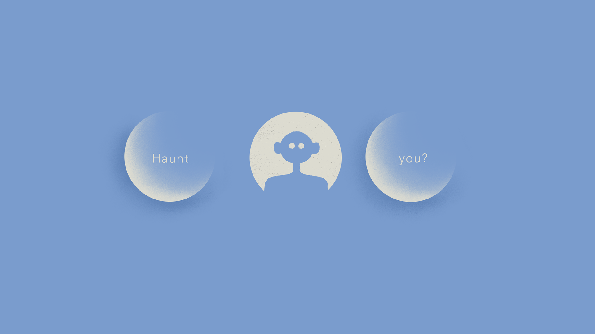
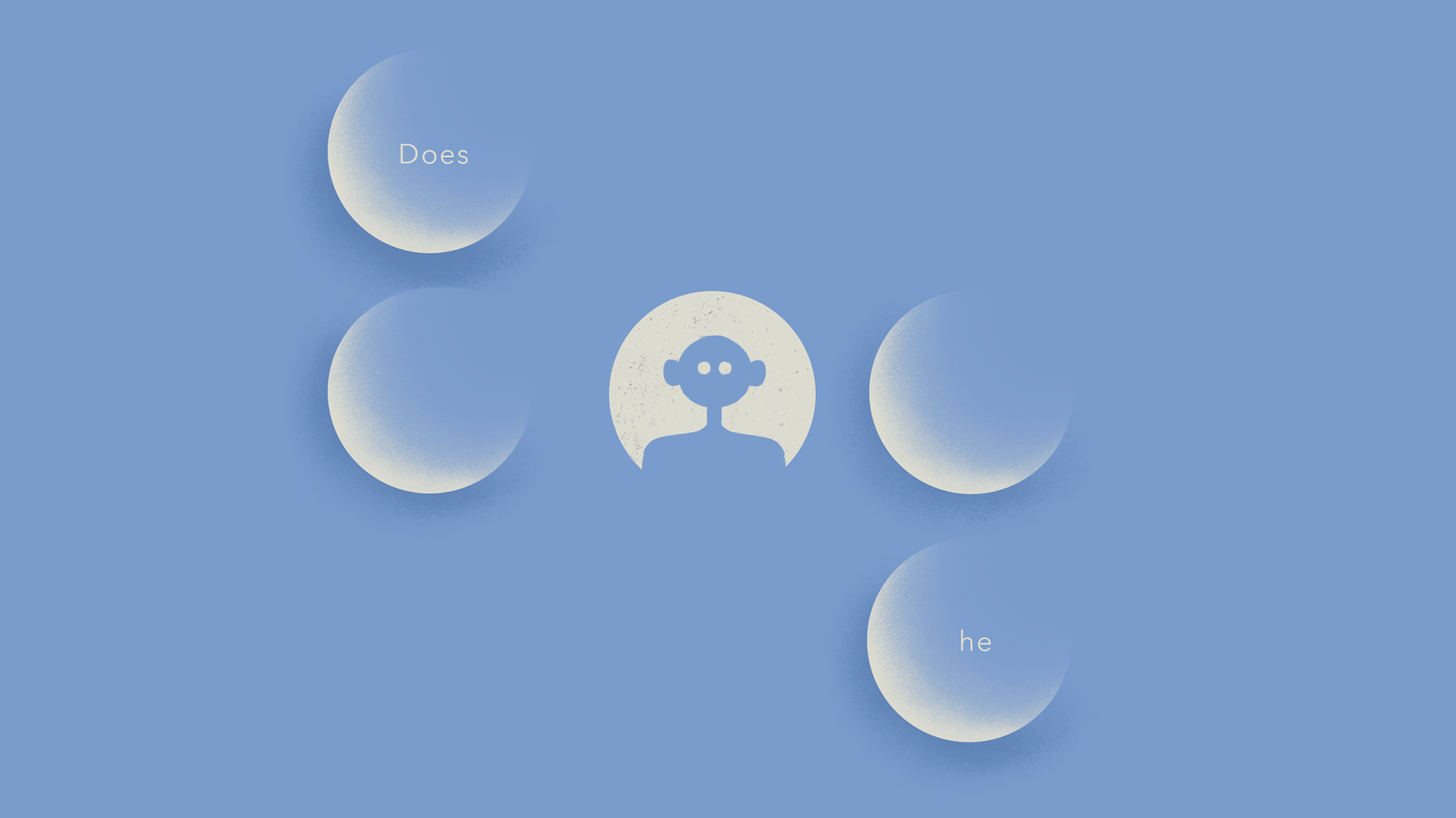
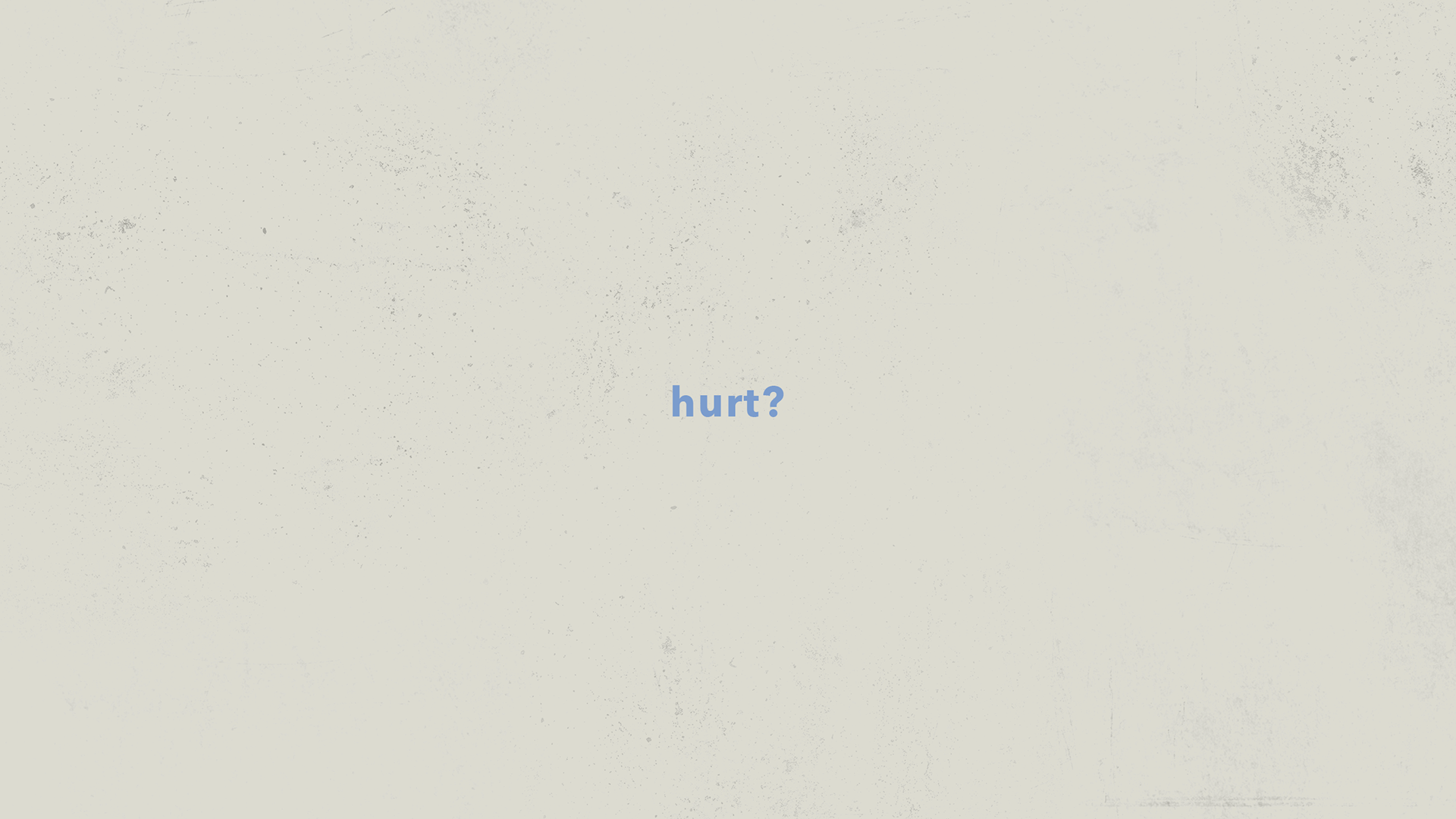
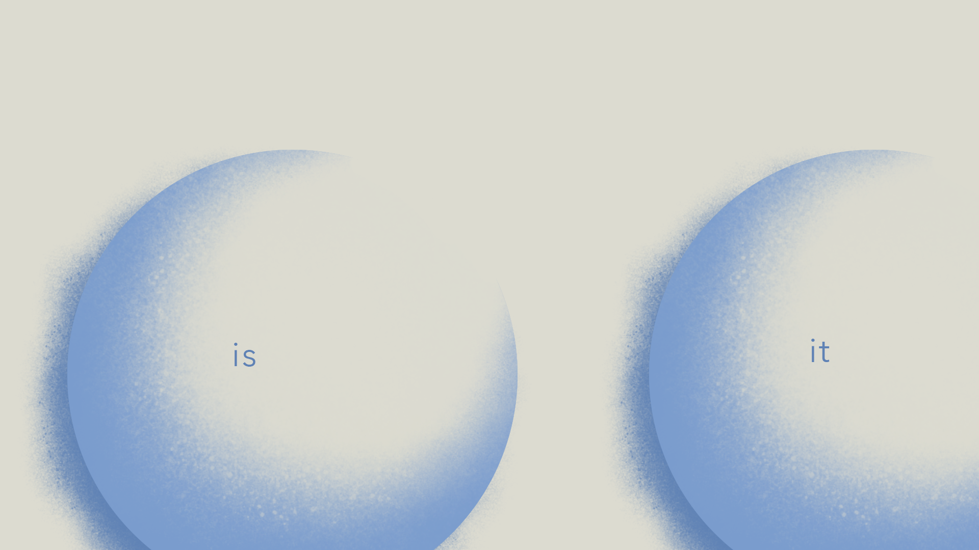
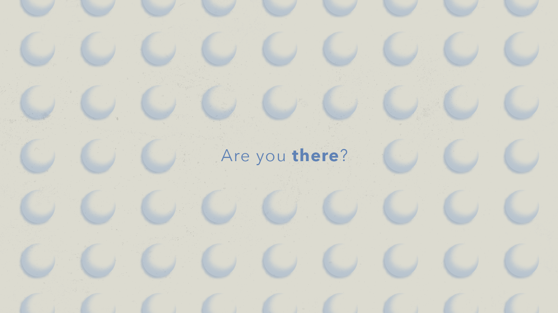
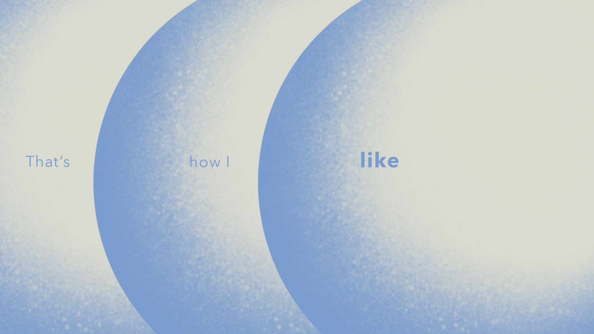
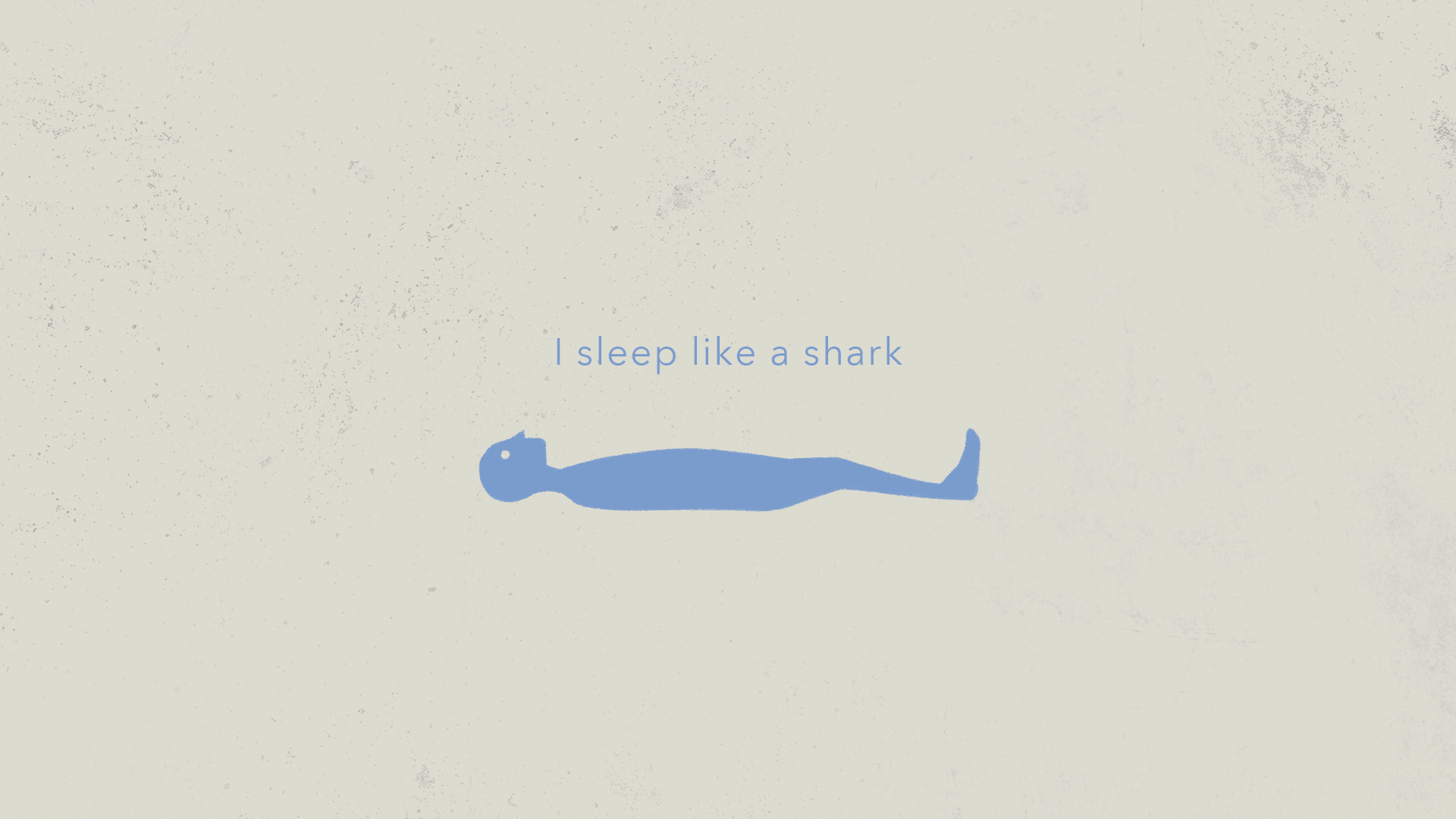
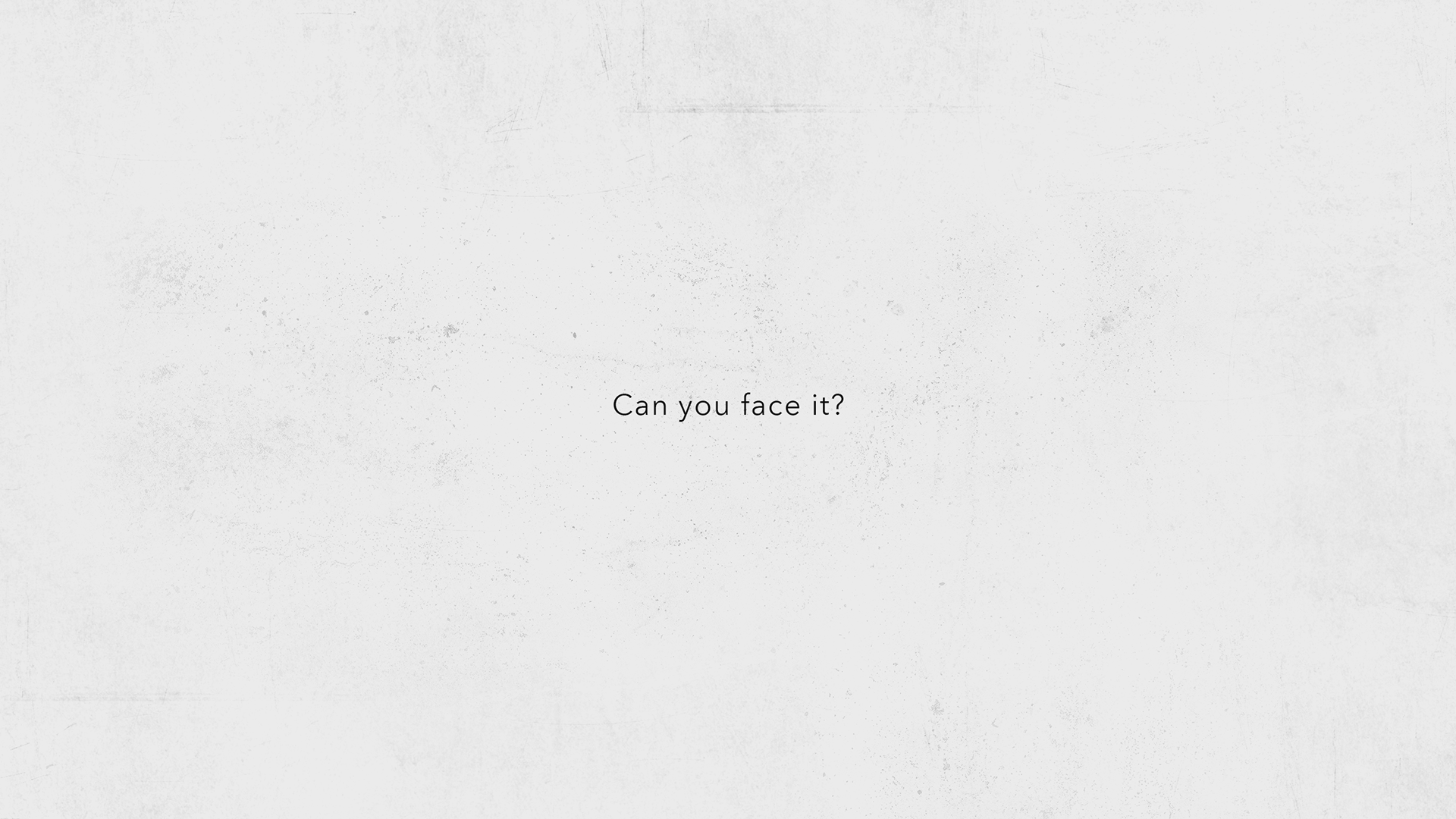
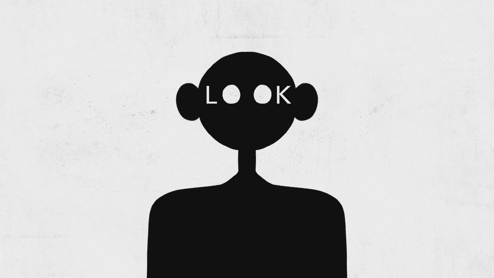
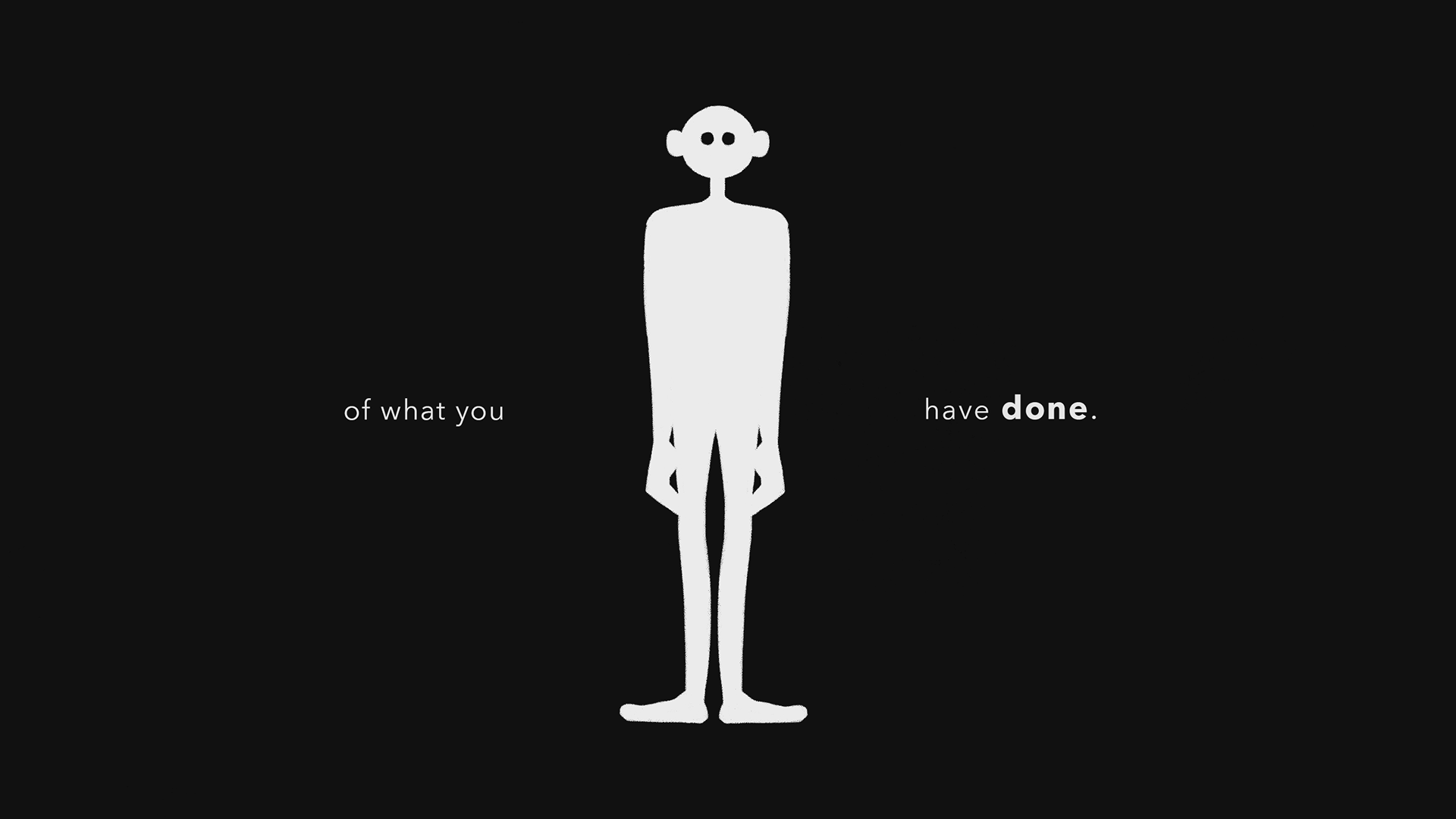
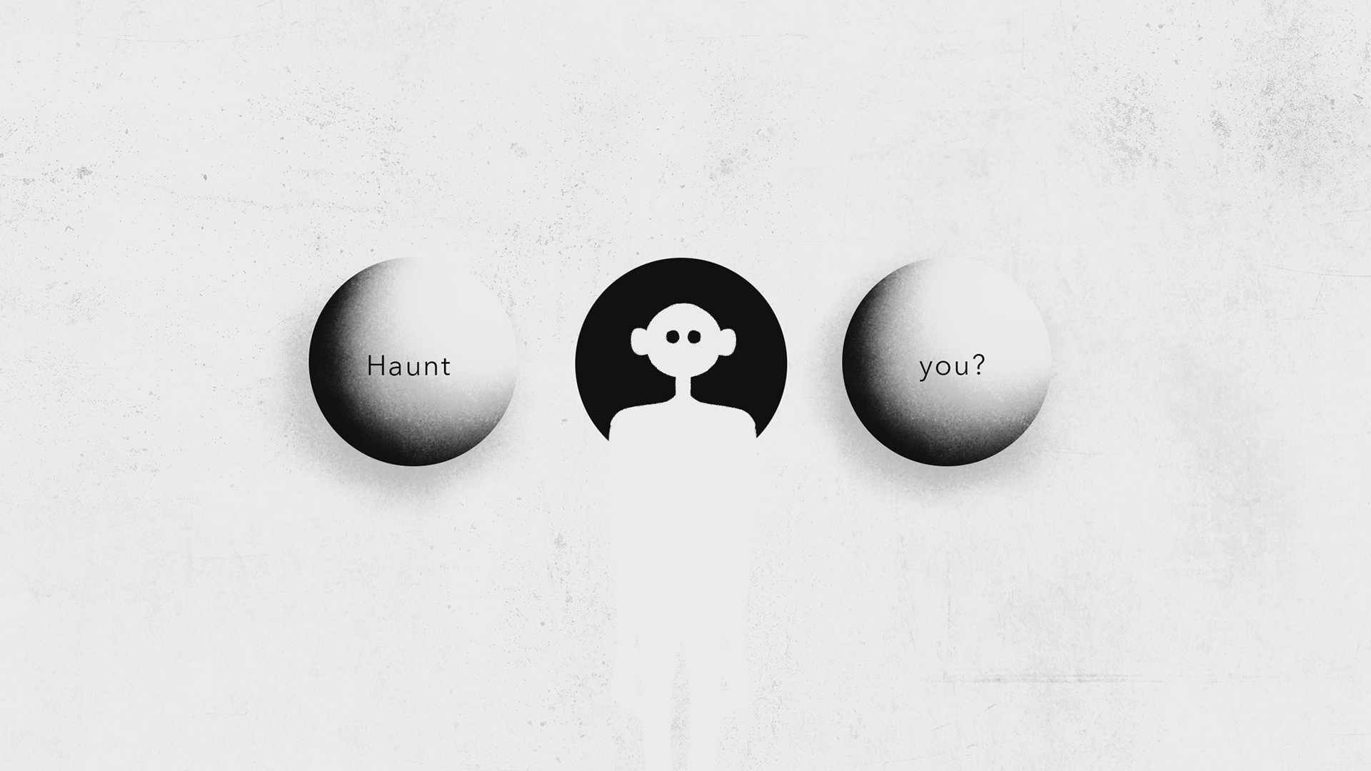
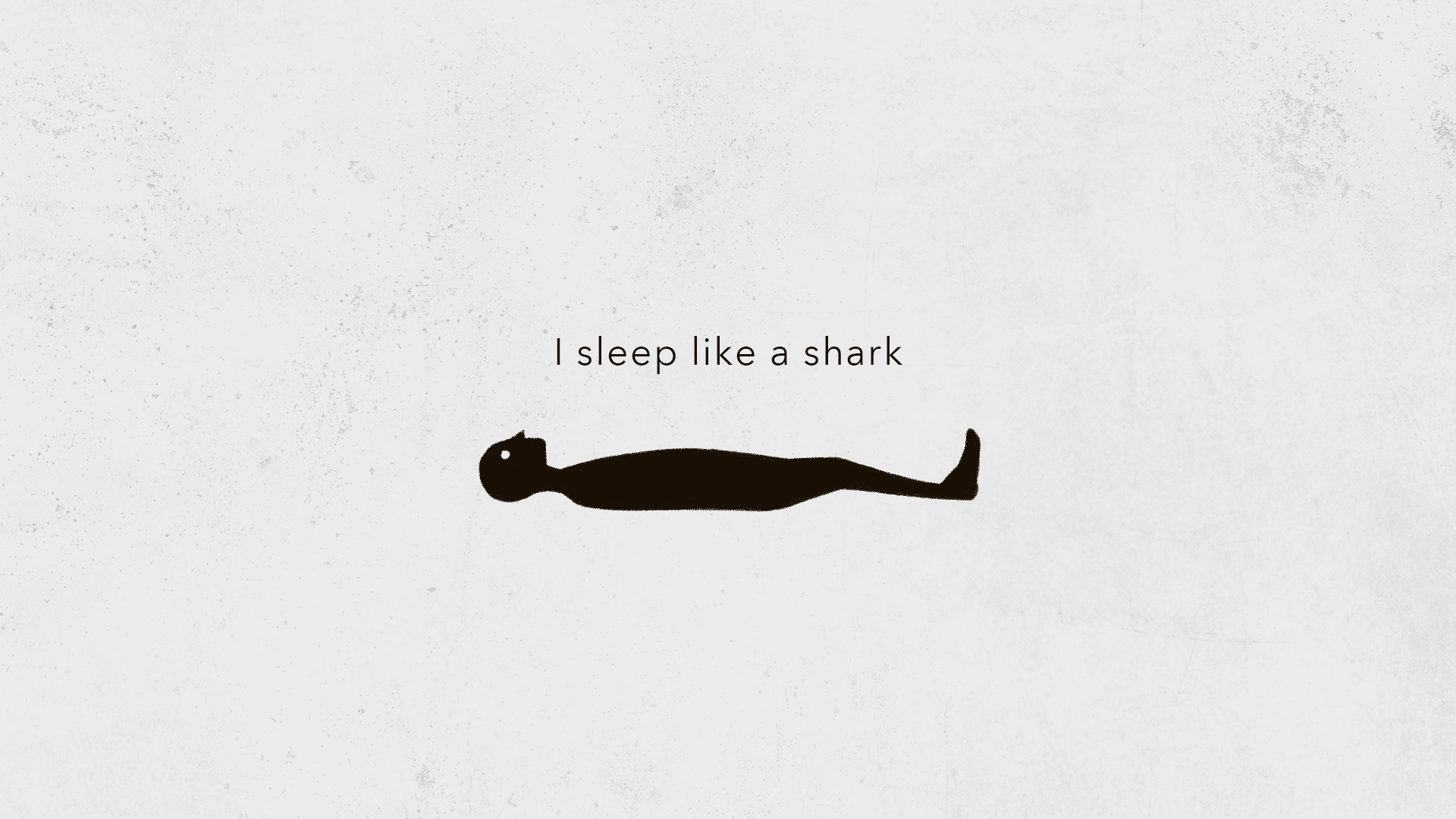
Typography choice ideation ; To match her quiet and soft voice, a sans serif font would be ideal. The song is very personal, and people don’t usually naturally handwrite in a serif font. The text itself should also be small throughout the piece to match the quietness in her voice, and to create an uneasy feeling because the audience must lean in and become one with the visuals of the song. Key or impactful words will be bolded instead of made bigger, because her voice remains soft throughout the song.
Color choice ideation ; Sometimes less is more, and from what I’ve gathered so far about the mood and tone of the song, 2 colors will suffice. I do not want the piece to be so overwhelmed with color when the song itself is not overwhelming and I do not want the color to take over the typography, but rather complement it. White may be too bright for this piece, a dusty eggshell or light grey would be ideal. Our second color can go one of two ways: Purple to create a more mysterious/mystical feel, or blue to give a more melancholic yet relaxing mood.
Animation ideation ; To create a unsettling yet personal feel, the frame rate will be dropped to seem choppy and more stop-motion/handmade-esque. A light displacement will be glossed over the final product so the type and graphics look more hand drawn. Besides the type, the graphics will overall have to be rounder or more organic looking because sharp graphics would clash with her soft voice.
Style Frames Version #01
Style Frames Version #02